Employee Feedback
WEB / VISUAL DESIGN
UX ENGINEER / DESIGNER
NETFLIX
Abstract
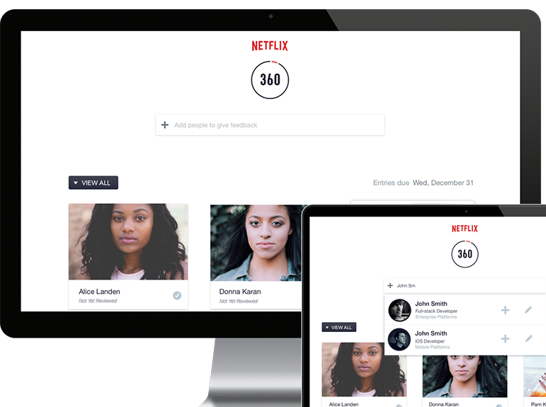
An app called 360 is an employee feedback app that needed to be redesigned to allow employees to give eachother feedback and managers to access feedback from their teams.
Design Objectives
- Easily search for people to give feedback
- Quickly see at a glance which feedback submissions were saved and which are missing
- Auto-include a users's direct reports if they have any
- Simplify the UX by eliminating the need for secondary pages
- Develop the front-end UI utilizing HTML/SASS/JS and Ember.JS and Bootstrap frameworks
UI Assessment - Design Decisions
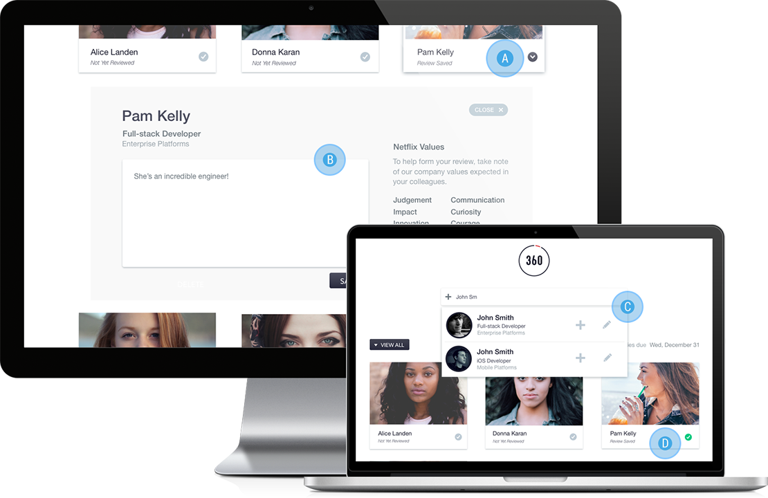
A. Select to Reveal: User selects the employee they want to give feedback to. The "completed" checkmark icon becomes a downward caret to indicate the slidedown component.
B. Employee Feedback Input: The accordian slidedown component allows the user to give feedback without leaving to a secondary page. This is helpful for users to stay on task and easily move on to the next employee. This component shows a a simple text field with basic employee info and a list of Netflix values for the user to keep in mind.
C. Search People: From the user study, I discovered that some users preferred adding employees before giving feedback while others want to immediately give feedback. The "plus" and "edit" icon gives users either option. The search results include basic info and photo for easy selection.
D. Checkmark: The checkmark icon is gray to indicate missing feedback and the green checmark means the employee has feedback saved. All users we tested understood this easily and found it helpful to see their progress.
User Test - Analysis Summary
I conducted a user test with 4 Netflix users, which included mostly managers and HR. Due to the nature of their roles, they were the users with the most requirements and extreme use cases.
In the first part of the test, we did not focus on the app, but their workflow regarding employee feedback
- All users created a list of people to give feedback to before writing any.
- Most user will use other text editors (ie. evernote, trello, google drive) to draft feedback before using 360.
- UX Analysis: The app needed a way to quickly compile a list and also provide a draft mode before finally submitting feedback.
I included a "Load My Direct Reports" button on the first screen to better undertand their expectations on what they wanted to see first
- All users understood 'direct reports' was a minimum set of people they had to give feedback to.
- Most users expected their direct reports to already be shown, without needing to select a button or create a list from scratch
- UX Analysis: The app would automatically show their direct reports on first load. This eliminates the need to create their own list.
We had the users use the search functionality on their own and talk us through the UI
- All users expected an auto-complete function when typing someone's name.
- All users understood the plus and pen icon meaning
- All users expected to search for anyone in the company
- UX Analysis: The search UI design was valid and needed no adjustments.
We gave the users a task to add 5 people and give them all feedback
- User failures or assists: none
- When adding people, users either kept typing or scrolled the results. This is seen as preferential.
- All users understood the checkmark icons in their gray and green states.
- All users liked the UI of the editor
- Some users expected to see a save button even though they knew it was auto-saved
- UX Analysis: I had to make the auto-saving message more prominent.
- User Rating: The ease of adding people was given a 4 or 5 by users, and the ease of writing feedback was given a 4 or 5.
