Android App Redesign
MOBILE / ANDROID
PRODUCT DESIGNER
Good Technology
Abstract
One of my main roles at Good Technology was to overview the Android experience across product lines. To ensure alignment with Android guidelines, I had to first assess their flagship product Good for Enterprise. Earlier releases of their Android app mimicked the iOS version, utilizing iOS patterns and visual styles. As this confused Android users, I followed Android guidelines and revamped the UI to create the correct experience that was understandable and attractive.
Role & Objectives
- Lead Android designer, sole designer responsible for the design from conception to release.
- Worked closely with Engineering/QA and Product ensure alignment on all requirements and deliverables.
- Modernizedd style and colors
- Stripped all iOS styling and elements, replaced them with Android equivalents
- Utilized official Android HOLO native assets
- Followed official Android 4.x patterns and metrics
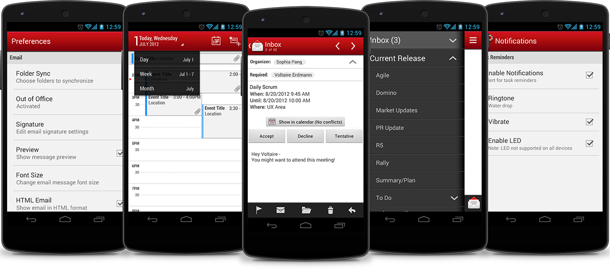
MODERNIZED COLORS
The color scheme from earlier versions was highly saturated, a style that felt outdated. To create a modernized look and feel, I decided to give the navigation areas (action bar, drawer, navigation bar) more contrast and depth with smooth gradients. I also toned down the backlight of list views, using off-white backgrounds and light gray headers.
HOLO NATIVE ASSETS
Icons seen in earlier releases of the Android app were borrowed from iOS, confusing the visual experience and platform paradigm. I replaced any iOS-specific icons for HOLO icons made available by 4.x. In doing so, Android users were delighted by familiar actionable assets that matched platform standards.
UI Assessment - UI and VD
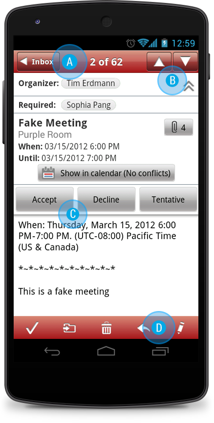
A. Action Bar
The action bar heavily copied iOS and needed to be completely refactored. The UI changes included:
- iOS breadcrumb replaced by Android “up” arrow with an app icon
- Centered-aligned title was made left-aligned
- Modernized background gradient for both Android and iOS
B. Custom VS Native Icons
Custom icons needed to be replaced by Android assets. This solves a few UI issues:
- The user does not have to relearn the icon
- Reusing Android icons helps to match the platform’s style
C. Font
The Helvetica font seen throughout the app had to be replaced by Android’s Roboto typeface.
D. Contextual Action Bar
The contextual action bar was given a dark charcoal color in replace of the red that repeated in secondary and contextual screens. The original red caused some visual design issues:- The color palette was too saturated for visual consumption
- The repetition caused a red “overkill”