The Latent Print
WEB & PRINT / REVAMP
CREATIVE DIRECTOR
THE LATENT PRINT
Abstract
The Latent Print was an art and literary project founded in San Diego, and in Jan 2010 I was recruited to be their Visual Arts Editor and Creative Director. Upon coming onto the team, it was an opportune time to revamp not only the website, but also the brand as a whole, visually re-framing the objective to support San Diego creatives with a new identity. Throughout my time heading the creative direction, I worked with local artists and writers while also expanding our network to studios around the world. We curated events and wrote online editorials to showcase local talent as well as artists from San the Bay Area, New York, Los Angeles, Austin, Detroit, Brazil, and Germany. The project offially ended in 2012 with our finale event Graffiti on Park.
Role & Objectives
- Sole creative designer and web designer/developer. Designed and developed the website from conception to completion
- Recreate the brand’s logo and type font to elicit a sense of creative force and literary prowess
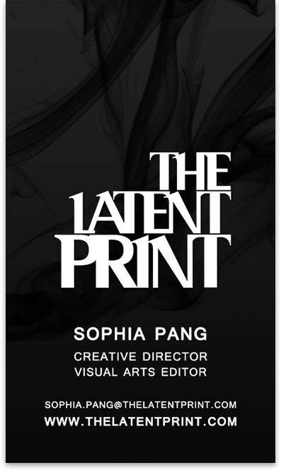
- Apply the new brand direction to all marketing material (flyers, business cards, promotional material)
- Create a platform in which local artists, writers, and poets could submit their work for consideration
- Release a new submissions flyer every year to seek out local creatives and promote contribtion to the project
- Capture an audience throughout the city with innovative print ideas
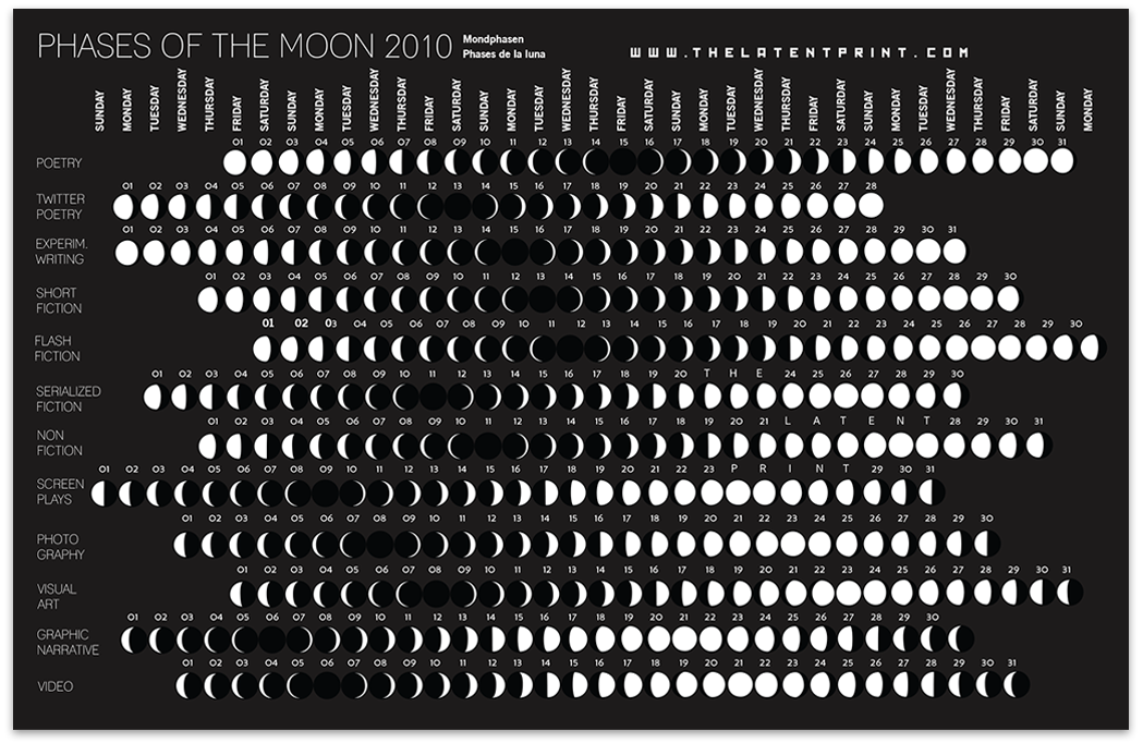
Submissions Flyer - Moon Phase Concept
I designed this moon chart-inspired flyer in parallel with the launch of the new website. This flyer gained notoriety among San Diego locals in coffee shops and co-working spaces, even showing up in an interactive exhibit at the Children's Museum.
Website - Design Assessment
This was by far my most ambitious web design revamp, as I had to re-imagine a site by taking an audit of existing content and do several iterations to obtain the best balance of visual design and content strategy.
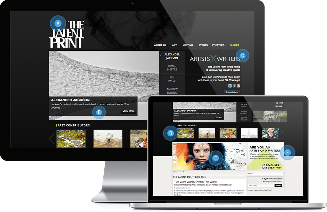
A. Logo
To create our new logo, I adapted the font “Serif”, overlapping the letters and creating an exaggerated slant on certain characters. I was able to maintain a “editorial look” while introducing a unique visual style.
B. Slideshow
Moving away from the previous grid format and using a slideshow, the UI organized new contributors featured every two weeks. The slideshow would cycle through the last six features, keeping the content up to date and relevant to our audience.
C. Brand Description
Tagline to draw creatives and readers to our brand and values. Includes our social media and a quote from K. Vonnegut to inspire our audience.
D. Daily Photo Features
Our “Photo Of the Day” featured curated photos found on the internet, from amateur to world-famous photographers and artists. This helped spread our brand to creatives who might not be aware of us otherwise, and also provided daily inspiration for regular visitors of the site.
E. Blog
The previous site didn’t include a blog, and it was important for us to regularly post Q&A's, event features, and community-related happenings. By feeding blog content to the homepage, users could read newly posted excerpts before navigating to full articles. This makes it clear that we didn't care about daedlines, we just wanted people to create their work and give them a space to highlight it.
F. Call to Submission
This graphic was included as a call to artists and writers to submit their work. This made it clear what we were looking for and a large call to action helped to bring submissions in.
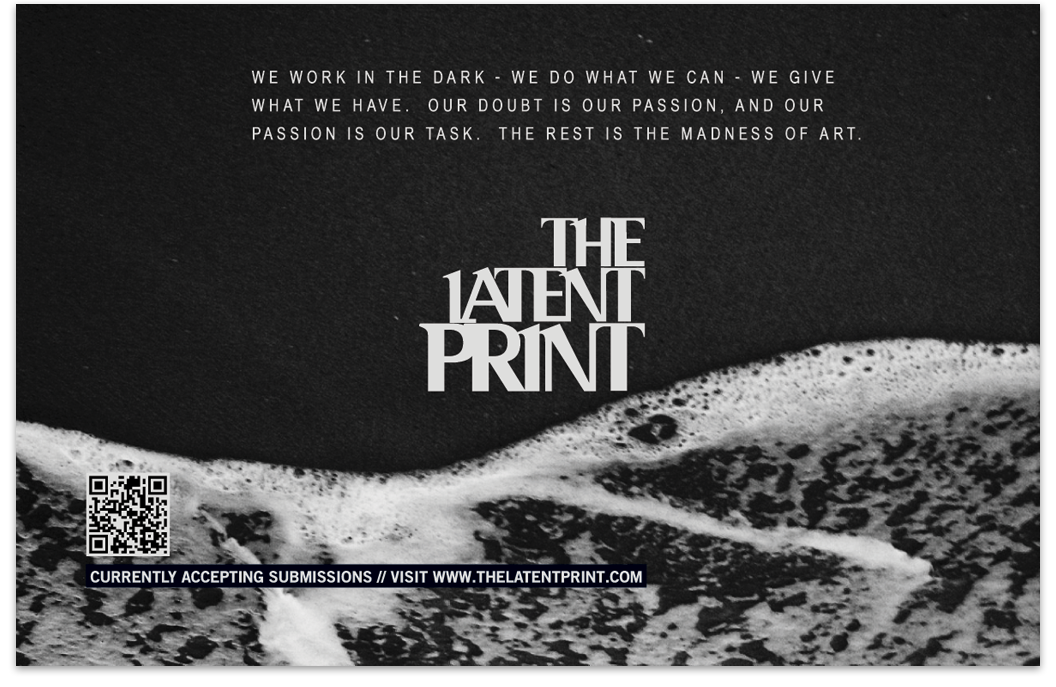
Submissions Flyer - Surf Concept
I designed this surf-inspired flyer to draw a relation to the beach culture of San Diego.