PlayStation Plus
CONSOLE
LEAD DESIGNER
PlayStation
Abstract
A new subscription model was created to provide a re-imagined set of features for a 3-tiered system. The base tier included the same set of features subscribers already had access to while two new tiers would offer expanded benefits at a premium.
Role & Objectives
- Lead designer, sole designer (IxD and VisD) responsible for the design and delivery of the 3-tiered subscription model
- Collaborated with other lead designers to create a design strategy to inform new and existing subscribers of the new tier structure and benefits
- Collaborated with content designers to create a content strategy that helps users understand the new benefits, differentiate between tiers, and convert to the tier that meets their interests
- Partnered with engineering and product to create a variable model that could support different subscriber scenarios (ie. new vs. existing subscriber)
Consolidating Subscription Services
PS Plus

PS Now

The business goal was to prioritize PS Plus subscriber growth by deprecating PS Now, merging PS Now benefits into the new PS Plus tiers, and introducting new benefits in the highest Plus tier
- Combining benefits from the two services simplified the subscription model, as users often didn't understand the difference between the two
- Current subscribers were incentivized to upgrade to the new, higher tiers to obtain PS Now benefits, allowing the company to consolidate the two services while deprecating the PS Now brand
- Potential subscribers would have more pricing options based on different sets of benefits, rather than only based on duration
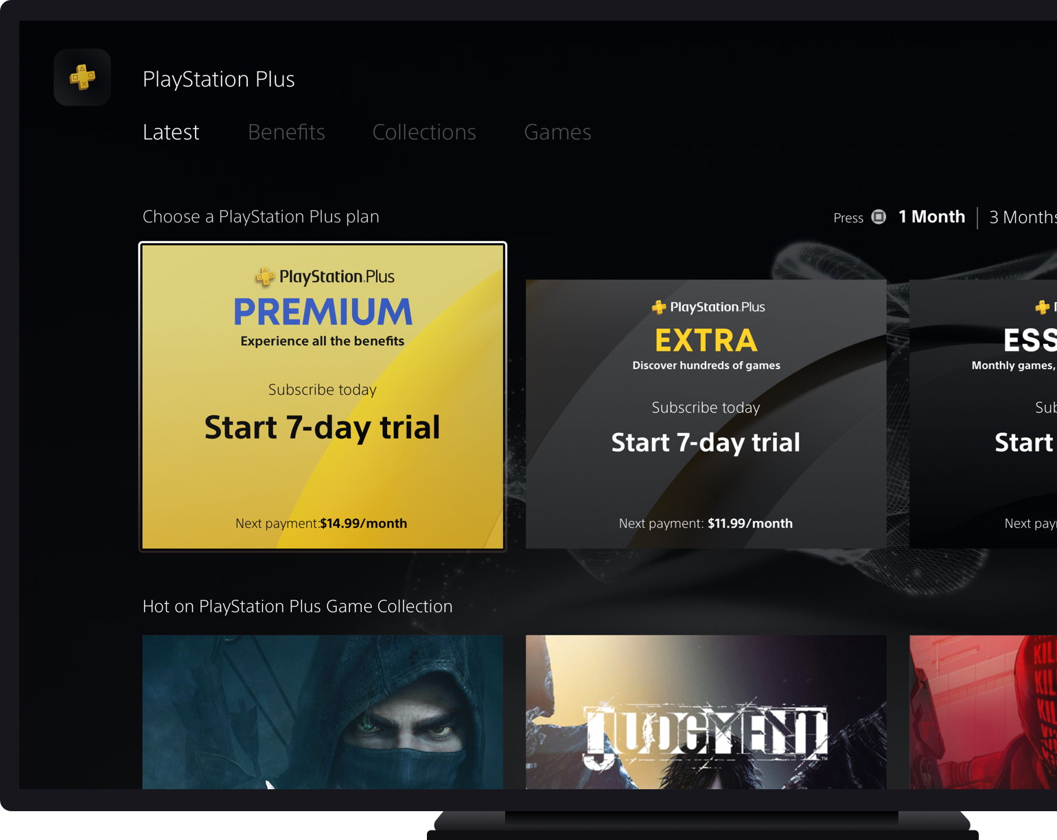
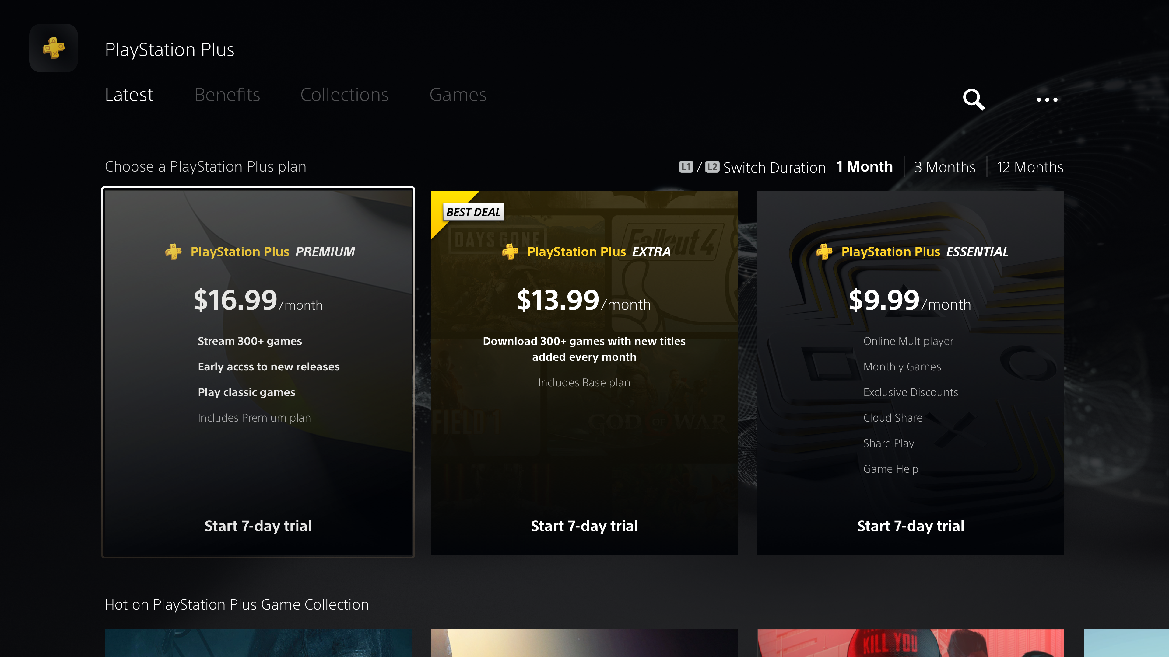
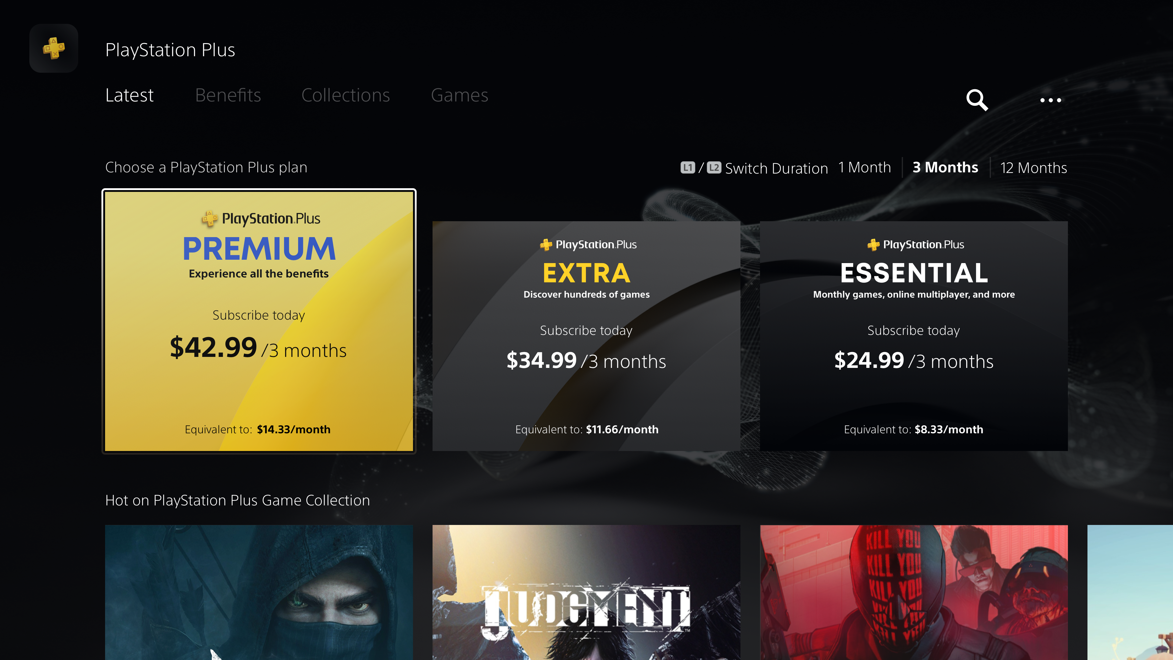
UI Assessment - Tier Selector
Layout for the 3-tier subscription model
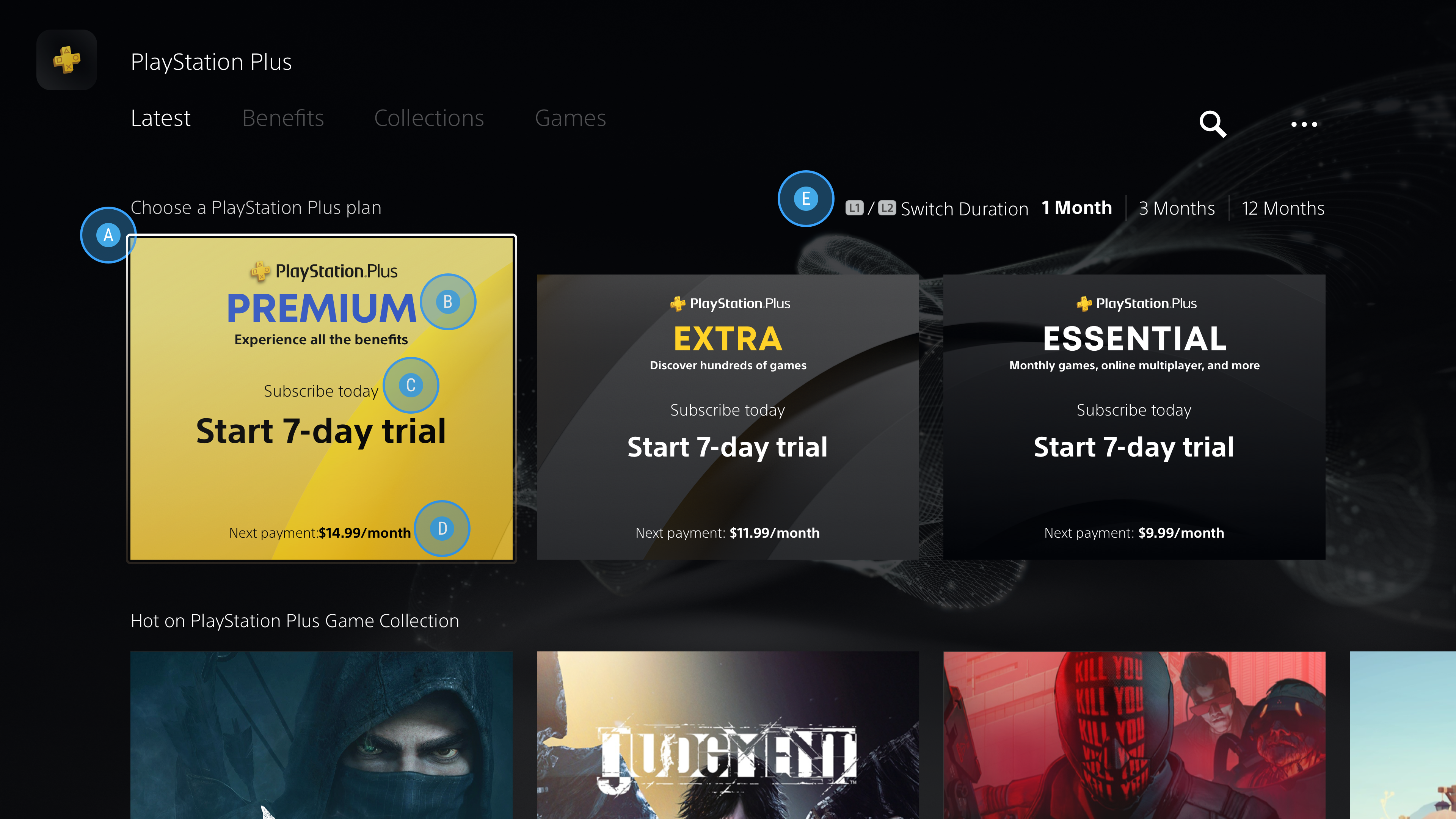
- Selectable Tier Component: The three tiers are visually distinguishable from each other, showing a progression with the highest tier being taller and bolder
- Tier Name and Short Description: The bold name gives clarity to the name of each tier and the subtext gives the user a high-level sense of what each tier offers
- CTA and Tier Price: CTA "Subscribe Today" or "Upgrade Today" followed by the trial copy or price shows the user the outcome of selecting the tier
- Additional Price Info (Optional): Any additional information that is pertinent to understanding the tier price
- Tier Duration Toggle: L1/L2 controls to toggle between different subscription durations
Research showed that ordering tiers from most expensive to least increases conversion rates. This ordering often directs users to a middle option that is perceived as a great value, also known as the "Goldilocks Effect".
Tier Selector Explorations
UI and content design iterations
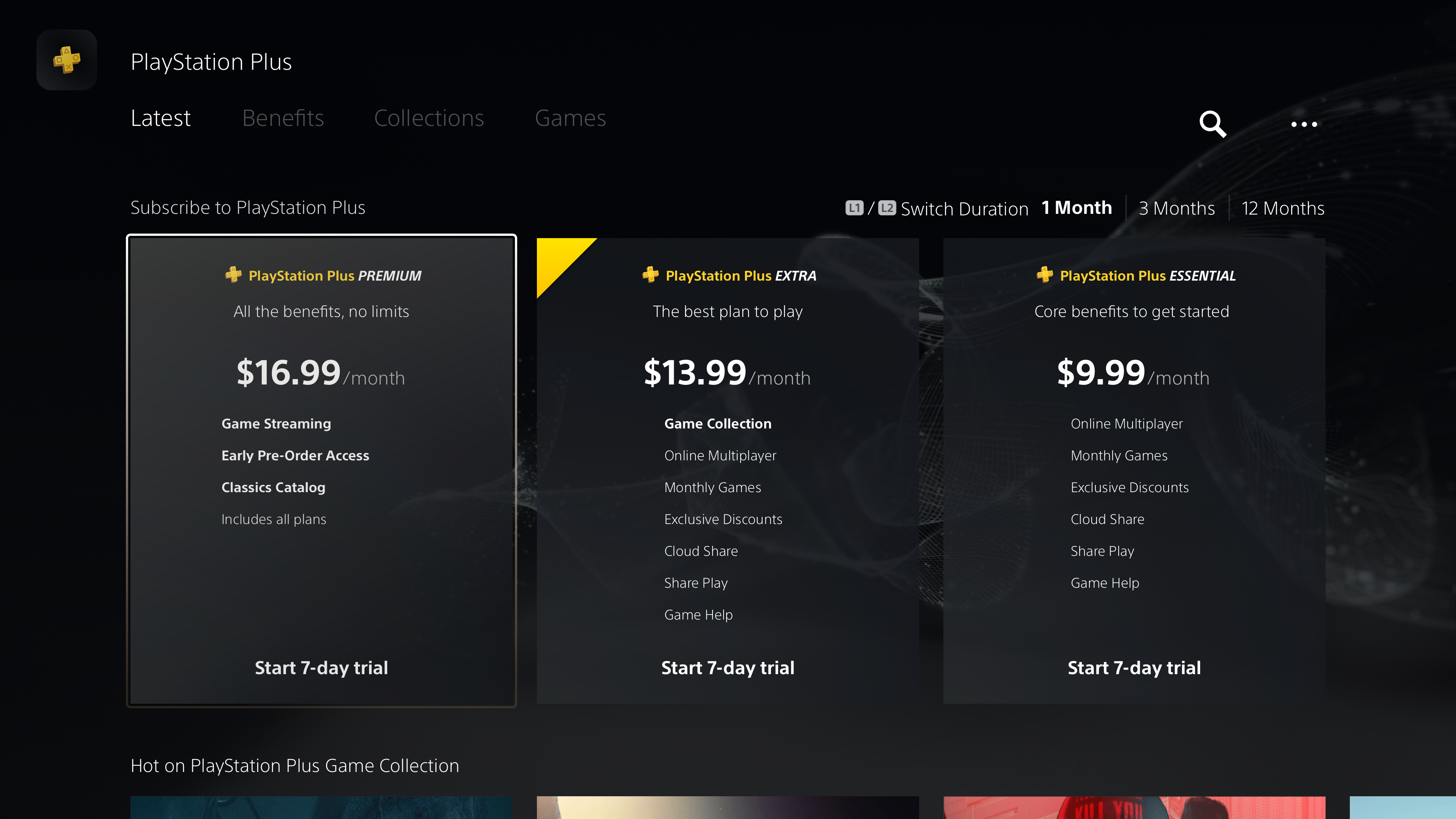
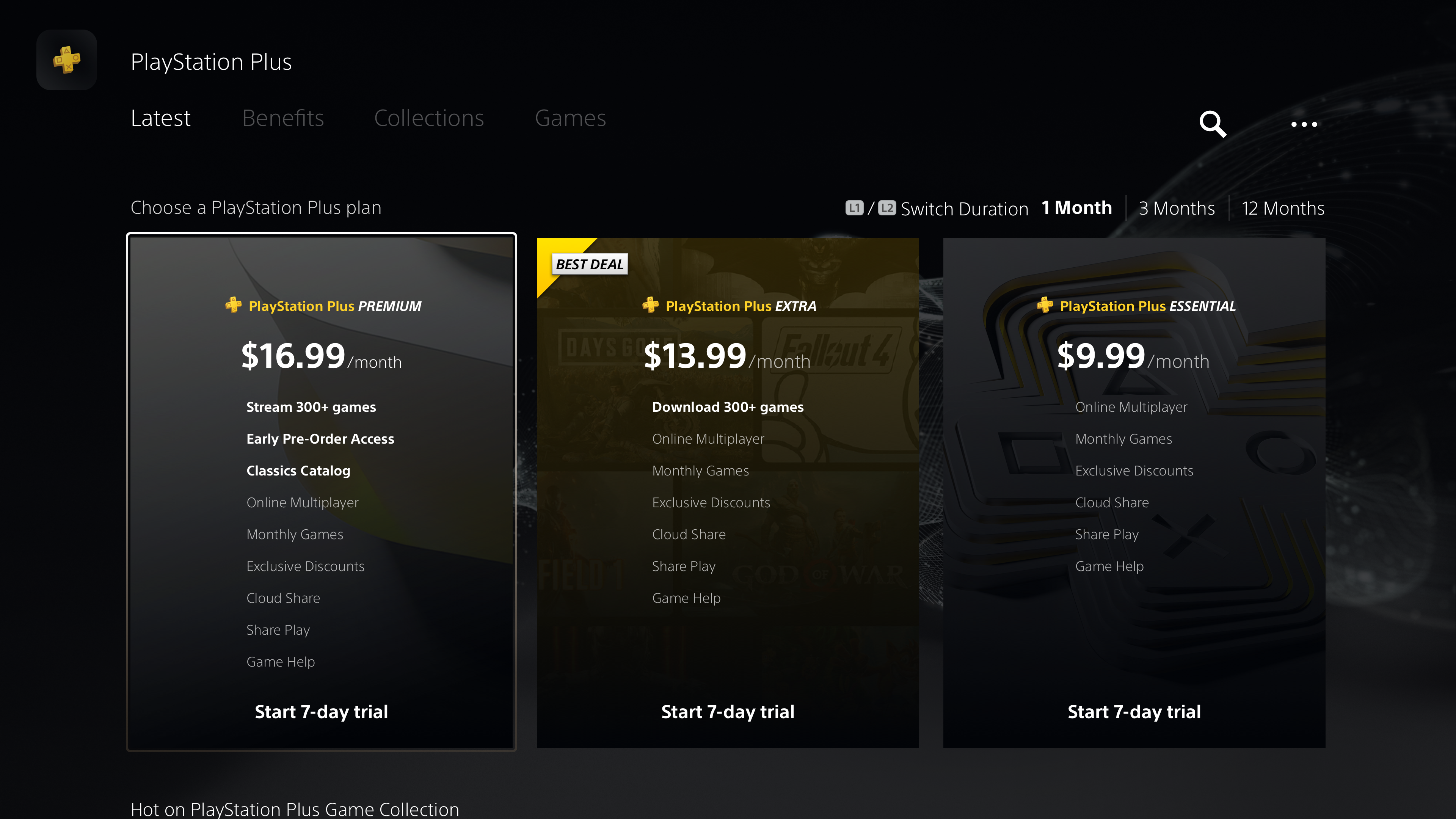
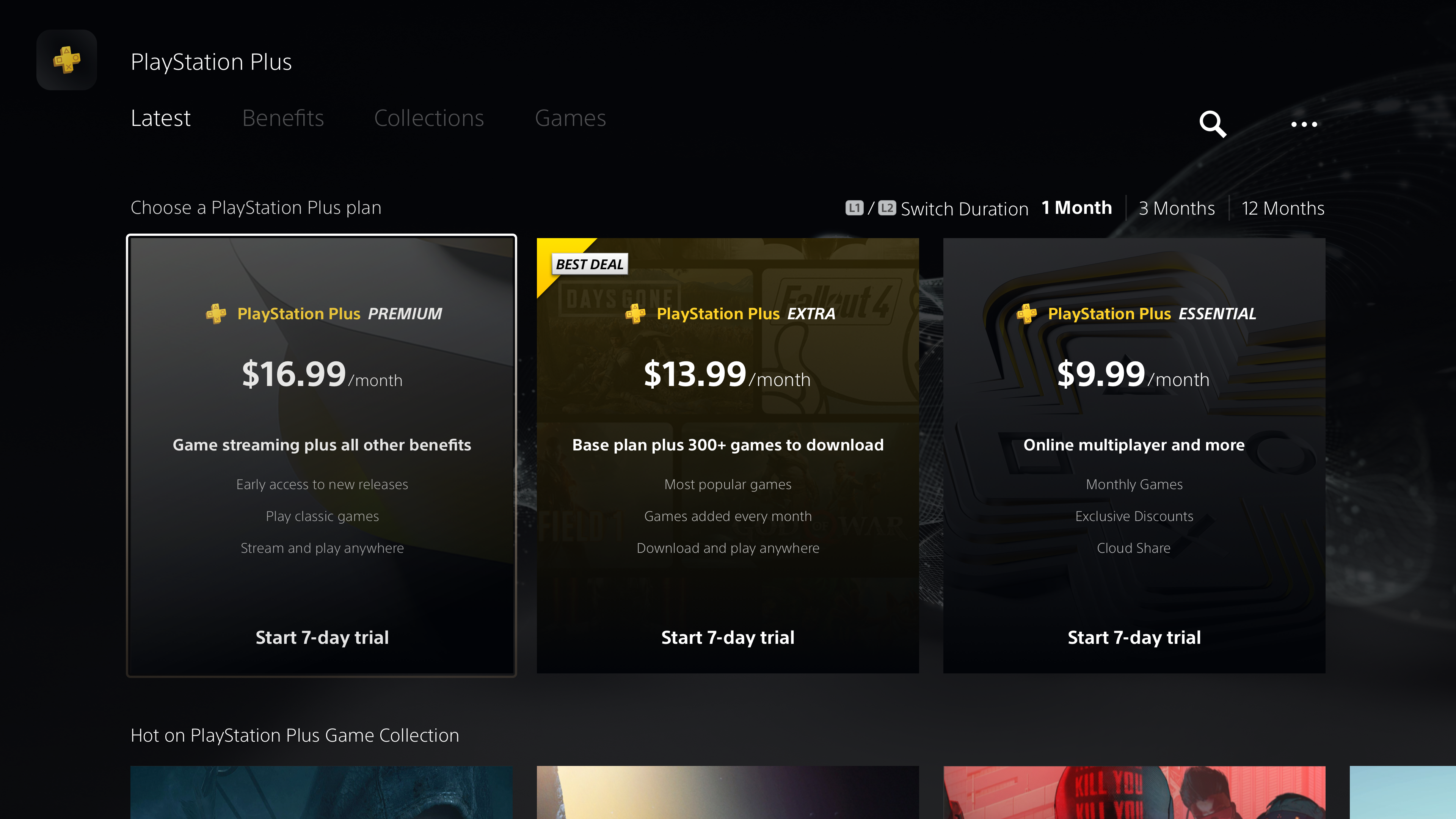
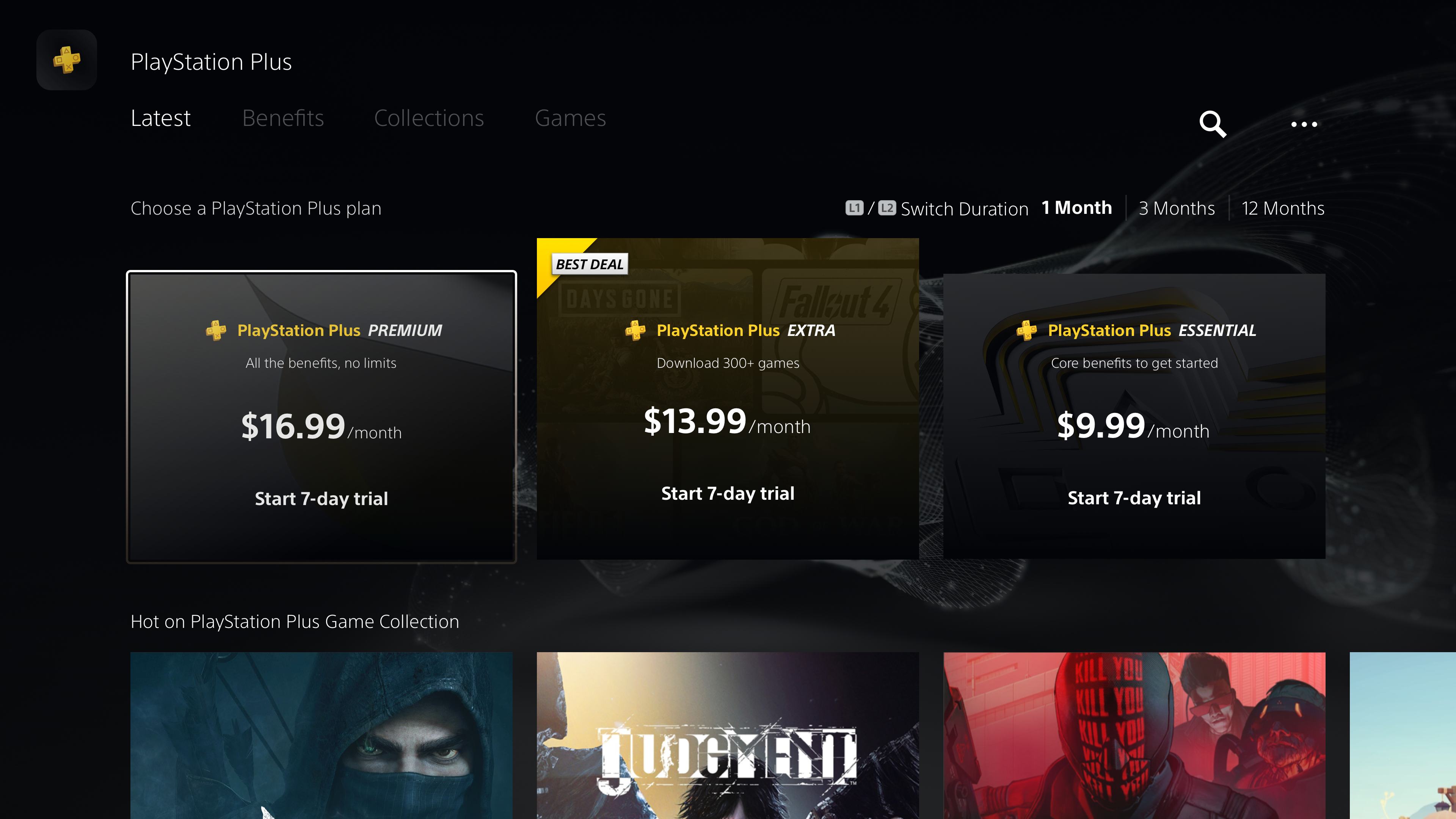
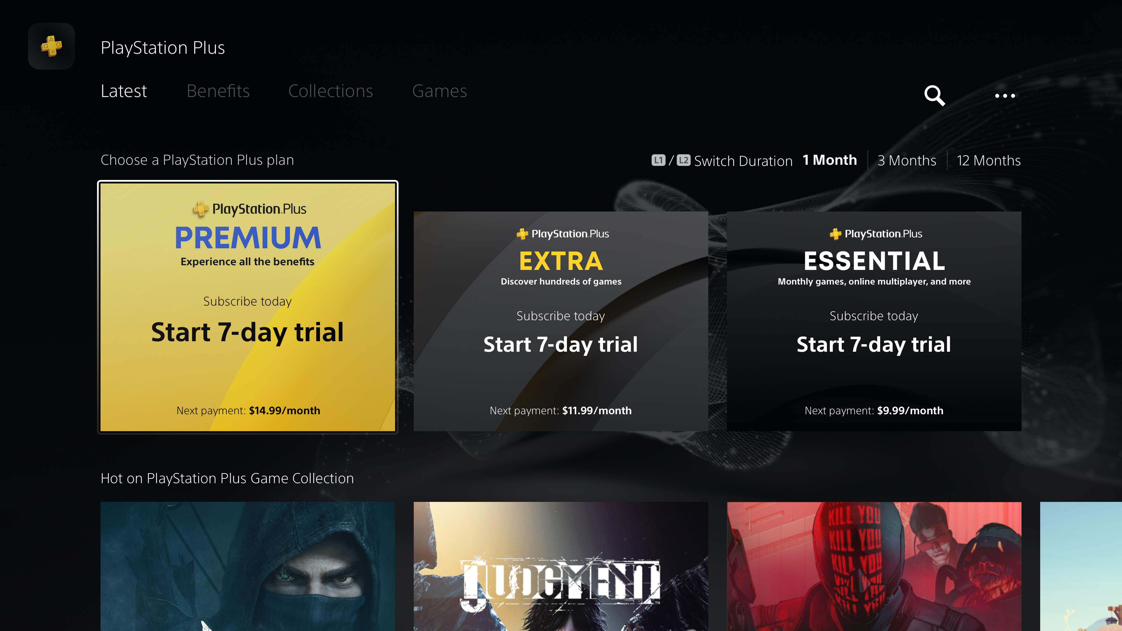


Communicating value with a list of benefits along with other information proved to be a content hierarchy challenge. Through rounds of iterations and user testing, we concluded that a descriptive title, a short value statement, clear pricing, visual importance to offers, and a CTA, provided the least friction.
- In the first example, at a glance the tier seemed to have the least amount of benefits
- "Game Streaming" and "Game Collection" did not describe the scope of game access. "Download 300+ games" and "Stream 300+ games" implied access to the same games. "Game Collection" was also not understood as the new name for PS Now, which was viewed as a major incentive to upgrade.
- It was not clear why the middle tier was advertised as "Best Deal", which would imply it covers most user needs
- Different iterations of listing benefits led to the same issues of competing information and users needing more time to scan
- In context of the PS Plus hub, users would always have the opportunity to learn about plans and benefits in more detail before choosing a tier. This allowed us to remove the benefits list and instead rely on a short description to restate value at a high level.
- Highlighting the introductory trial promotes a risk-free opportunity to try a service and is a seamless path to conversion.
- Highlighting the retail price followed by the monthly breakdown gave users a clear understanding of the financial commitment.
Customer Conversion Journey
Diagram showing the user journey before conversion
- While the tier view allowed users to compare prices, it did not give users a way to compare tier benefits
- With 10 total benefits, and more to include in the future, we needed to design a feature that would show a complete list of benefits across tiers
Journey mapping the path to conversion showed users needed a way to compare tier benefits and not just prices
Comparison Matrix
Interactive module for comparing tier benefits
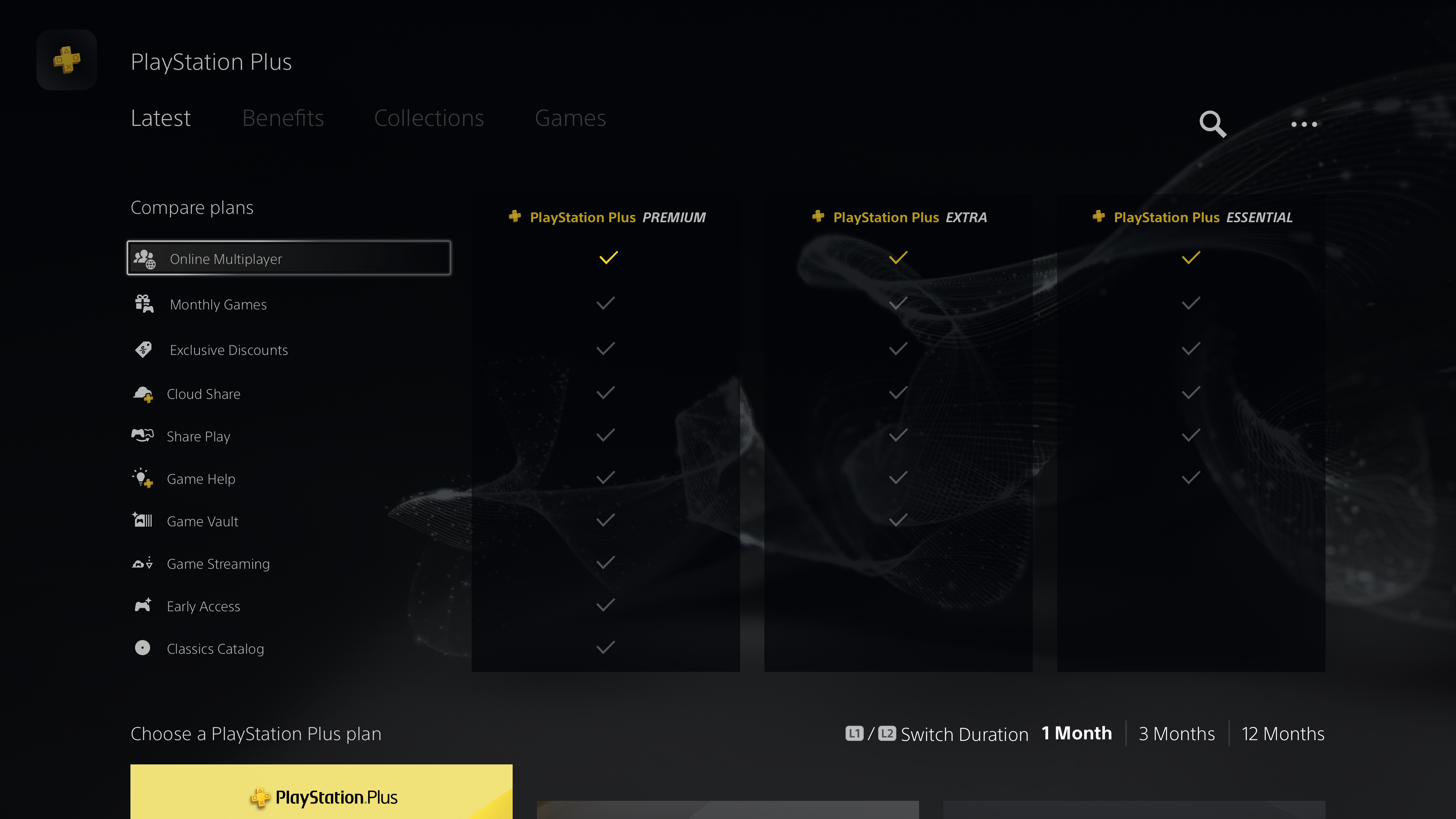

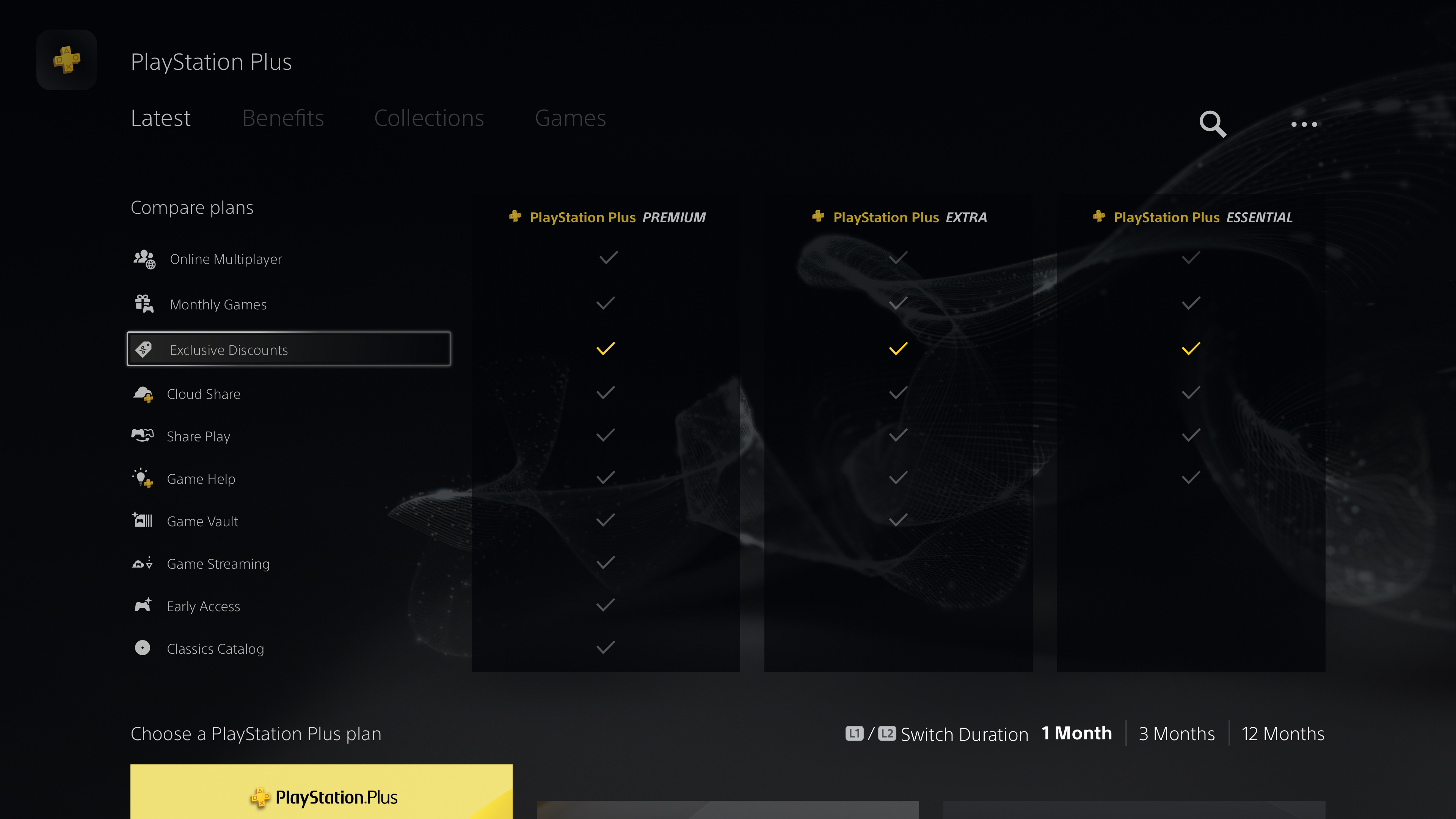
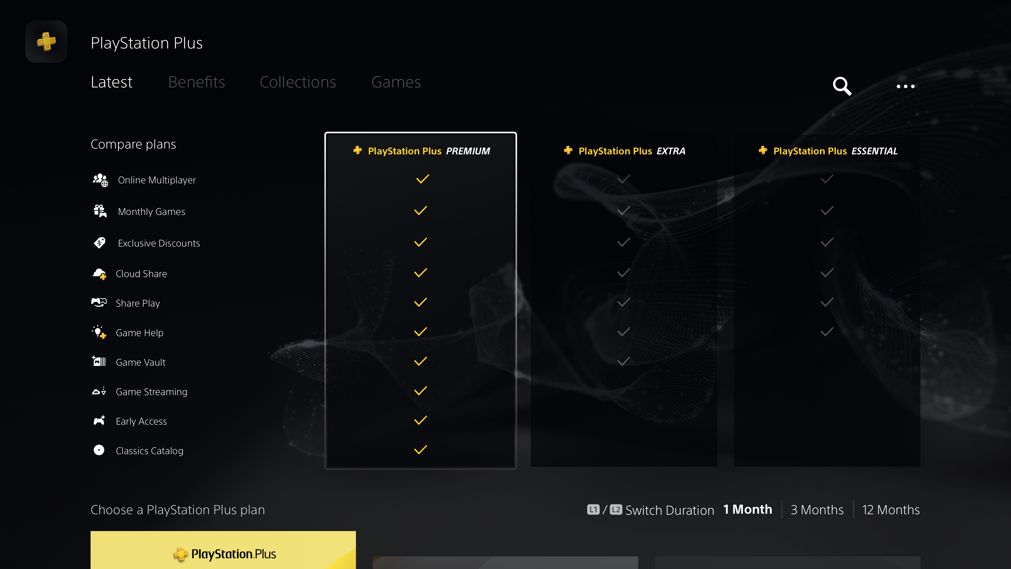
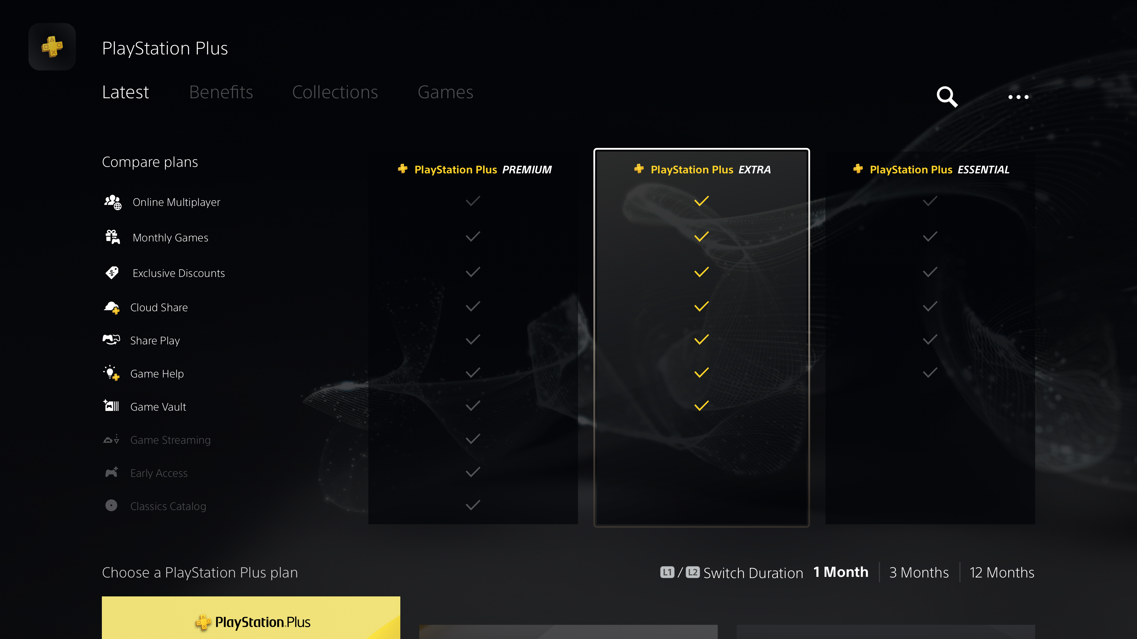
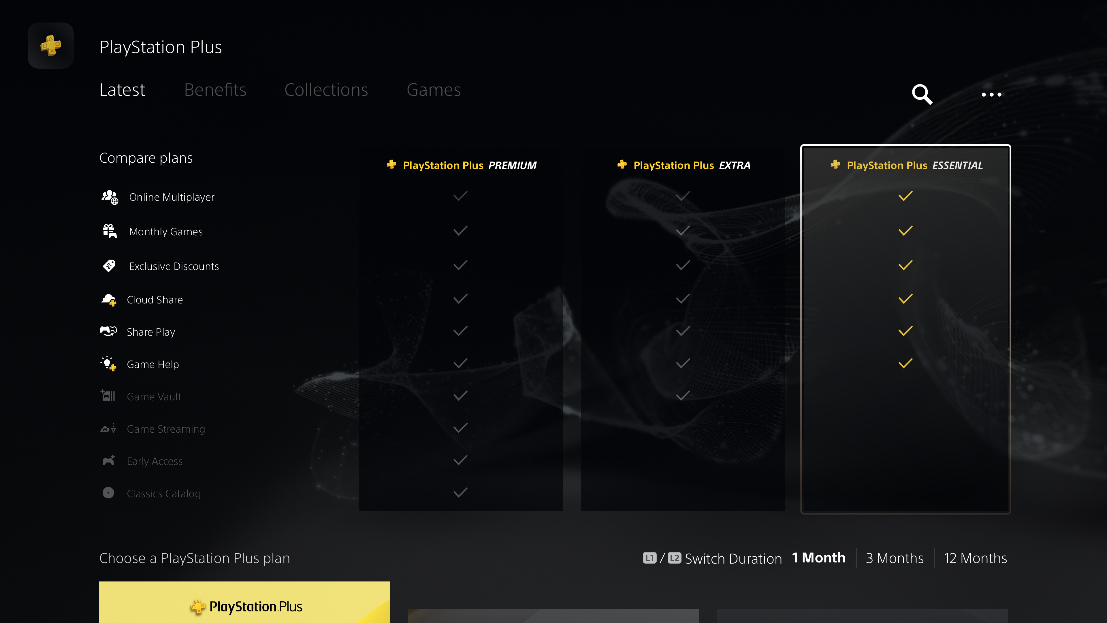
To compare benefits across tiers, the interactive matrix relies on the controller's directional keys
- Users are able to view the full set of benefits in each tier
- Iconography that is repeated throughout the PS Plus Hub is also shown here to help users with visual recall
- Highlighting checkmarks helps users compare tier benefits and see which benefits are included in each tier
